Customer: MYParliament
Modern Youth Parliament Fellowship Program is a platform where the youth of India gets a chance to understand the governance and the public policy so as to get involved in the policy making process and play their part to shape a better India. Our team was tasked to present their idea through a visual treat. So, let’s take a look at the thought process and the challenges faced while working on the video for this project.
Enter Kinetic Typography
Jotting down the idea in form of a crisp script lead us to a thought of choosing a medium to bring out the best of it. After discussions and a lot of thinking, we came up with an idea of giving a kinetic typography treatment to the whole concept. Now, the question arises is Why Kinetic typography? Well the famous saying is,
“Typographical design should perform optically what the speaker creates through voice and gesture of his thoughts.” – El Lizzitsky
It is the written form of what we are thinking or saying inside our heads and also how we are saying it. My Parliament has an agenda to push and to let that agenda successfully reach out to people. Expressing the language through type is the key. Adding to that type helps you create unique visuals (where none really exists) by adding emotion to the important words.
Well the main challenge was transforming the script into a meaningful, expressive visual by adding life to the words that defines the concept. In short, choosing the font style and how that font is applied in juxtaposition to the other elements on the screen and then working on the factors like color theme, elements connecting one scene to the other, building up on important words in the script, and audio ( voice over and the background music).
Core elements of the Video
MyParliament video was weaved around 6 core elements:
1. Mascot
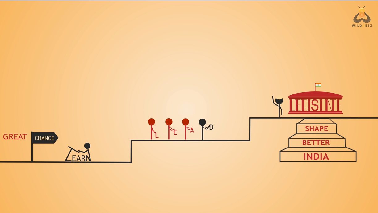
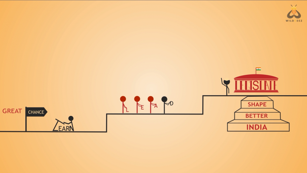
Since the fellowship program is targeted towards Youth, we thought of representing the Youth through an icon that takes us through the whole video and keeps us connected to the storyline. So, we infused the human silhouette into the letter Y and we got our representative.
Letter Y of ‘Youth’ as a human silhouette
2. Font
One of the most important element of typography. Research on fonts led us to a conclusion to use a font which is humanist and not so thin, not so bold; which makes text legible to read on screen. After trying lot of fonts, we chose humanist sans serif font ‘ Trebuchet MS ‘ and bold typeface.
‘Trebuchet MS’, humanist sans serif font
3. Colour Palette
Keeping My Parliament branding in mind, we used a gradient of orange and white for the background and gave contrasting colours to the text coming on the screen so as to make the text more readable and clear. Dark maroon for the important words and dark bluish for the connecting words.
Background color in contrast with the text color.
4. Flow
Since we have our mascot representing Youth, it becomes important to use it in a flow that keeps the viewer connected to the concept. The flow depicts the journey of the character through the story
The character moves from one scene to the other
5. Word Representations
Highlighting important words in every single scene not just through animation but also with the visual form depicting their true meaning gives more appeal to the video.
Word ‘create’ is in form of bricks
Word ‘Legislate’ as the pillar of the parliament building
6. Climax
The fellowship program is divided into three stages that enable youth to Learn, Lead and Legislate during the term. In the concluding screen, we have represented this in stepped format to depict the fellowship as a platform to shape a better India.
The Final Video
Share your views, ideas, and comments to help us create some more amazing stuff. Let there be more awesome videos in the World!